 Wallaby FlashをHTML5に変換する
AdobeがFlashをHTML5に書き出すツール Wallaby を公開したようです。
Flash® Professional って記載されてるけど、Flex じゃダメなのかな? 今度の例会で質問してみよう。
アプリのUI
UIは凄い質素です。
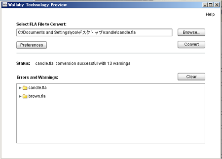
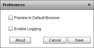
設定もログモードとブラウザ起動設定くらい。
コンバート
手っ取り早く、Flash CS5のサンプルでConvertしてみる。
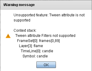
サポートされてないモジュールがあるとWarningがでる。
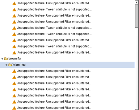
Filter、Advanced Color等、機能によってはコンバートできない。
HTMLファイル構成
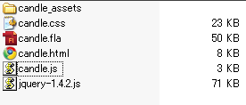 ・jquery: 1.4.2
でもアニメーション処理は、してない模様。
・jquery: 1.4.2
でもアニメーション処理は、してない模様。
・css: CSS3で webkitのみ対応 CSSアニメーションを使ってるので、重たいと思われる。
・svg: 画像はSVGフォーマットを利用
動きによって CSS3、JavaScriptを使い分けている模様。
実行結果
アニメーションの基本仕様は、Safari Reference Library -Animations を参照
JavaScript側で webkitAnimationIteration、webkitAnimationStart、webkitAnimationEnd でイベントリスナーを登録し、CSS側で @-webkit-keyframes from ... to を作成。
■JavaScript
candle.js
・「xxxx_sprite」「xxxx_fs」htmlクラスのエレメントを探す ・左右の揺れは、CSS クラスから -webkit-animation-duration を取得しアニメーション終了時間を計算 ・次のエレメントの取得は nextElementSibling を利用 ・display: none, block でパラパラ描画
function wlby_calc_timeout(c) {
    var timeout = (new Date).getTime();
    while (c) {
        timeout += parseFloat(getComputedStyle(c)['-webkit-animation-duration']) * 1000;
        c.timeout = Math.round(timeout);
        c = c.nextElementSibling;
    }
}
var wlby_hide_children = function(self) {
    var c = self.firstElementChild;
    while (c) {
        c.style.display = 'none';
        c = c.nextElementSibling;
    }
}
var wlby_activate_sibling = function(evt, self) {
    if (evt.srcElement != self)
        return;
    if (self.style.display == 'none')
        return;
    if (!self.timeout)
        wlby_calc_timeout(self);
    self.style.display = 'none';
    var sibling = self.nextElementSibling;
    if (!sibling)
        return;
    while ((sibling.timeout < evt.timeStamp)&&sibling.nextElementSibling)
        sibling = sibling.nextElementSibling;
//    $('.wlby_fs', sibling).css('display', 'none');
//    var n = new Number((sibling.timeout - (new Date).getTime()) / 1000);
//    sibling.style.webkitAnimationDuration = n.toString() + 's';
    sibling.style.display = 'block';
};
var wlby_activate_children = function(evt, self) {
    if (evt.srcElement != self)
        return;
    wlby_hide_children(self);
    var c = self.firstElementChild;
    if(!c)
        return;
//    $('.wlby_fs', c).css('display', 'none');
    wlby_calc_timeout(c);
    c.style.display = 'block';
    c.style.webkitAnimationDelay = '';
}
var wlby_loop_children = function(evt, self) {
    if (evt.srcElement != self)
        return;
    wlby_activate_children(evt, self);
    var c = self.firstElementChild;
    if (!c)
        return;
    c.style.webkitAnimationDelay = '0s';
}
$(document).ready(function() {
    $('.wlby_sprite').each(function()
        { this.addEventListener('webkitAnimationIteration', function(evt) { wlby_loop_children(evt, this); return false; }, false, false) });
    $('.wlby_sprite, .wlby_graphic').each(function()
        { this.addEventListener('webkitAnimationStart', function(evt) { wlby_activate_children(evt, this); return false; }, false, false) });
    $('.wlby_fs').each(function()
        { this.addEventListener('webkitAnimationEnd', function(evt) { wlby_activate_sibling(evt, this); return false; }, false, false) });
});
■CSSの一部抜粋 ・@-webkit-keyframe の opacity でフェイドイン・フェイドアウトを実現している [css] @-webkit-keyframes wlby_frameset-animation { from { } to { } }
.wlby_fs, .wlby_graphic { -webkit-animation-name: wlby_frameset-animation; }
.wlby_graphic { -webkit-animation-duration: 1s; }
.wlby_masked { height: inherit; position: inherit; width: inherit; }
.wlby_sprite { -webkit-animation-name: wlby_frameset-animation; -webkit-animation-iteration-count: infinite; }
@-webkit-keyframes wlby_KF_3 { from, 4.49% { -webkit-transform: matrix(1, 0, 0, 1, -0.452, -5.589) skew(-69.891deg,27.062deg) scale(1.0112, 0.2792); opacity: 0.200259; } 5.61%, 8.98% { -webkit-transform: matrix(1, 0, 0, 1, -0.452, -5.589) skew(-69.891deg,27.062deg) scale(1.0112, 0.2792); opacity: 0.168419; } 10.11%, 14.6% { -webkit-transform: matrix(1, 0, 0, 1, -0.452, -5.589) skew(-69.891deg,27.062deg) scale(1.0112, 0.2792); opacity: 0.200259; }
....
.wlby_4 { -webkit-animation-duration: 2.90323s; -webkit-transform: matrix(1, 0, 0, 1, -25.05, -29); -webkit-transform-origin: 20px 106.95px; }
.wlby_47 { -webkit-animation-duration: 0.0322581s; display: none; position: absolute; -webkit-transform: matrix(1, 0, 0, 1, -13.95, -28.55); }
.wlby_48 { -webkit-animation-duration: 0.0322581s; display: none; position: absolute; -webkit-transform: matrix(1, 0, 0, 1, -13.65, -28.25); } [/css]